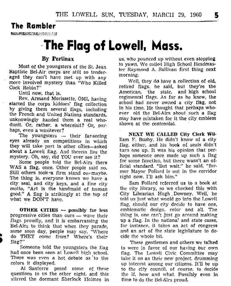
In November 2014, the inspiration came to Mark. He was listening to the 99% Invisible podcast, which was running a story on how the city of Portland, Oregon wanted to redesign its municipal flag. Proponents of the change complained that the city’s flag was, basically, a city seal on a bed sheet. Mark thought about that, and wondered what Lowell’s flag looked like. He later discovered that Lowell’s flag also looked like a bed sheet with the city’s seal on it. He researched the story behind the flag and its history, building on work done before him by people like Dick Howe, who had already completed a very informative article on the city seal. He also contacted the Lowell Historical Society to ask about its origins. He learned that the flag had been adopted ‘around 1960.’ No one seemed to know more. A lot of people he met seemed unaware that Lowell even had a flag.
We looked into its ourselves, checking old newspapers and searching Facebook groups;. We found some mentions, mostly from the original contest that created the flag over 50 years ago; another spurt of articles hit local media around 1980 when city officials discussed making the flag more suitable for the printer technology that existed at the time. We were starting to understand the reason why Lowell’s flag has remained so unknown.
So, Mark started the discussion about redesigning the city’s flag.
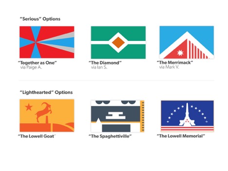
‘Why change the flag? Doesn’t Lowell have bigger problems?’ Lowell-minded Facebook users asked. ‘Hey, aren’t you from Dracut?’ Others quipped. A few people on social media went so far as to poke fun at the effort, making up joke flags for Dracut and other towns in Greater Lowell. Rather than take it to heart, Mark’s Lowell Flag team used that same idea to create less serious “fun” flags highlighting some of Lowell’s quirks. And to those who maintain that Lowell has bigger fish to fry, the Lowell Flag team replies: “While yes, there are certainly more important issues, that doesn’t mean it is not worthwhile to look into smaller tasks like this one. It’s small but a great community activity, and something that could be foundational to how we and others view our community.”

Not one to think he can go it alone, Mark started a Facebook collaboration group for like-minded Lowellians and other people who love Lowell to connect and work on flags together. Some flags look as you might expect; they show canals or mills, or the Merrimack River. Some of the other flag designs might surprise you. One memorializes the famous Lowell goat, another the Pow-Wow Oak; there’s even a nod to Prince Spaghetti among the flag designs. Still another design captures Lowell’s Kilt Guy. The inspiration for that flag came as a pick-me-up after the man was egged over a weekend.
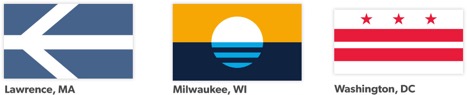
For the Lowell Flag team, the flag re-design is a worthy endeavor. It’s something that can bring the community together, in an effort to celebrate Lowell, and to commemorate its happier and prouder points. There’s also the promise of the revenues coming from merchandising too. Flag re-design worked for Milwaukee and South Bend. It could work for Lowell too! There are certainly plenty of outlets for such merchandise.
It’s important to point out that neither Mark nor anyone else in the group is in this for personal gain. They merely see an opportunity for Lowell to refocus how it represents itself visually. They are donating their time and effort to hopefully see that goal realized. They also do not want to point out that they are not trying to do away with the city seal – any potential flag would exist alongside the seal as a complementary piece of the city’s identity.
In addition to designing possible flags, they’ve also been working on recruiting a pool of judges to vote on the potential flag designs. To date, he’s recruited a number of local members of the business and art communities to his effort. However, the Lowell Flag effort still needs official support from Lowell’s City Council or Planning Department to move forward. Without local government support at the outset, history has proven initiatives like this often fail. A prime example of this is the 2009 effort to redesign the Oregon flag. Even Milwaukee, which has had several failed flag initiatives in the past, has not yet gotten a Common Council blessing on the most recent endeavor.
At the lowellflag.com website he maintains, Mark advises that flags should follow five basic design rules:
- Keep them simple.
- Use meaningful symbolism.
- Use two to three basic colors.
- Don’t use seals or lettering.
- Be distinctive.
Do these design rules sound familiar?
As Mark notes, city flags often get overlooked for their state and national counterparts. Done well, though, flags can instill a sense of pride in a city, and provide it with a renewed image. When communities unite to identify the symbols and images that are most meaningful to their existence, the result, a flag, draws that community together and imbues it was a revived sense of identity. It cannot be a one-man show, but Mark’s been gracious enough to step forward and offer to write the first lines.
To get involved with the Lowell Flag team, think up your best ideas and check out the following:
- Instagram: http://instragram.com/lowellflag
- Facebook: http://facebook.com/lowellflag
- Twitter: http://twitter.com/lowellflag
- Email: lowellflag@gmail.com
- Facebook Collaboration Group: https://www.facebook.com/groups/lowellflag/
